Creative Packaging Design From The Mobius Awards in Los Angeles
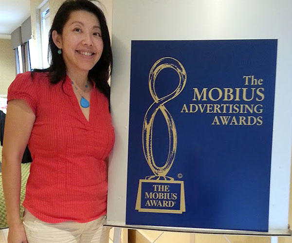
We were recently honored to be invited to judge the packaging design entries for the Mobius Awards in Los Angeles. Mobius Awards is one of the oldest international packaging design competitions in the world having been established in 1971. Each year the design competition recognizes outstanding work in packaging design, brochure and book design, photography, print, television and radio. Mobius Awards is produced by the wonderful Lee Gluckman Jr. out of his offices in Los Angeles, California. Visit Mobius Awards for more information on how to submit entries for next year’s packaging design competition.
A common theme for many of the product packaging entries was the use of package design to re-position the client’s product as a premium product compared to its competitors on the retail shelf. Another common strategy was to build brand value over time by magnifying the brand presence within the product packaging. Here is a small selection of packaging design which we felt stood out from the pack and were successful in their product positioning.
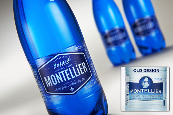
Montellier Mineral Water Packaging Design
We think water bottle packaging represents the true power of packaging because what else but packaging could compel a consumer to purchase a product for a premium when it is so readily available for free from the household faucet? In our opinion, the design team did a fantastic job re-positioning Montellier as an upscale contemporary mineral water with the addition of a dark blue bottle, rich blue label and modern type design. The bold logotype increase brand awareness on the shelf and a nice and subtle product reference is made with some sparkling bubbles surrounding the dot of the “i” character in the logotype. The new label design is bold, elegant and suggests a contemporary premium product.
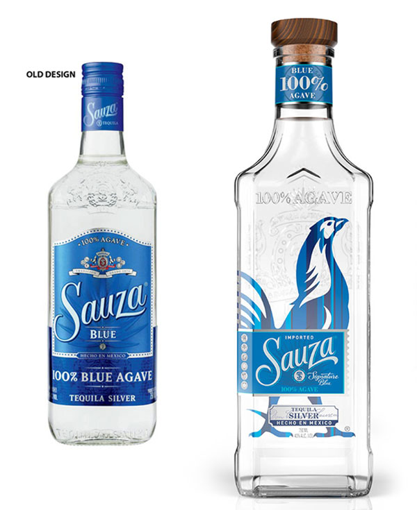
Sauza Tequila Liquor Bottle Packaging Label Design
Sauza has done a good job re-positioning the Sauza brand as a contemporary tequila while promoting the brand value of 100% agave cactus ingredients. The rooster graphic is bold and youthful while the wooden cork, the list of awards and the elegant glass bottle design all support the brand proposition of quality ingredients, taste and proud history that make the Sauza brand a premium shelf tequila.
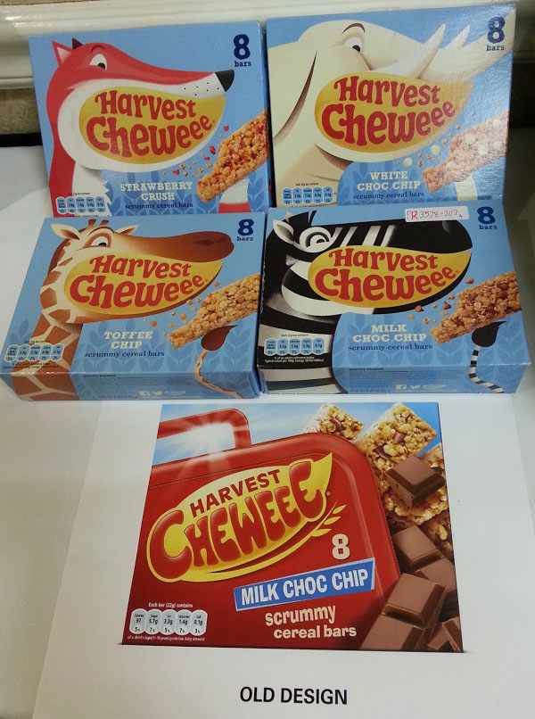
Harvest Cheweee Granola Bar Packaging Design
We commend Harvest Cheweee for bringing fun back into product packaging with their eye-catching, humorous and engaging animal illustrations eating their granola bars while also providing a unique and consistent area for brand identification. It’s seems clear that Harvest Cheweee granola bars wants to appeal to mothers packing lunches for their school children and applaud their efforts to remove the “lunch box” from the product packaging in order to create a visually appealing packaging design that truly appeals to their target audience – kids!
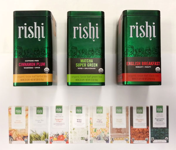
Rishi Tea Packaging Design
In our opinion, Rishi tea has effectively re-positioned the Rishi brand as a premium product by utilizing a nice metallic tin container for their packaging rather than a standard paper box. The Rishi brand is also elegantly emphasized with big bold letters that are embossed on the front of the packaging. With the new prominent brand image, if you are looking for Rishi tea you shouldn’t have a problem finding it on the shelf. The line illustration background and product name over a black background also help to position Rishi tea as an upscale product while the bold san-serif font and elegant design appeal to a more youthful and contemporary audience.
We look forward to judging next year’s Mobius Awards packaging design competition and appreciating even more creative product packaging design from around the world.